BlankMe - Foundation
Client:
BlankMe
Year:
2021
Design:
United Design Lab
Studio Aslak Siimes
Keywords:
Design strategy
Industrial Design
User Experience
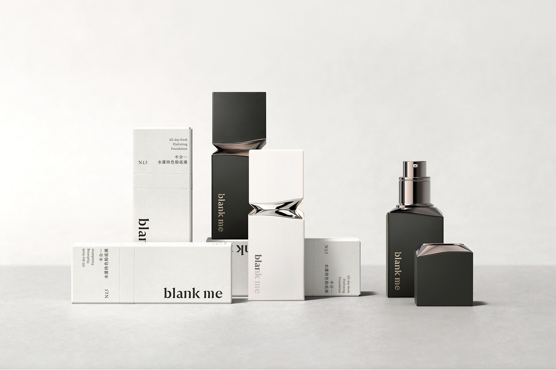
A new chapter for Blank Me begins with a study of form and material. Designed for a professional cosmetics range, the foundation packaging draws from the language of minimal plaster sculpture. A solid geometric volume is shaped by a single dividing curve, introducing rhythm within a stable form and defining a balance between structure and flow.

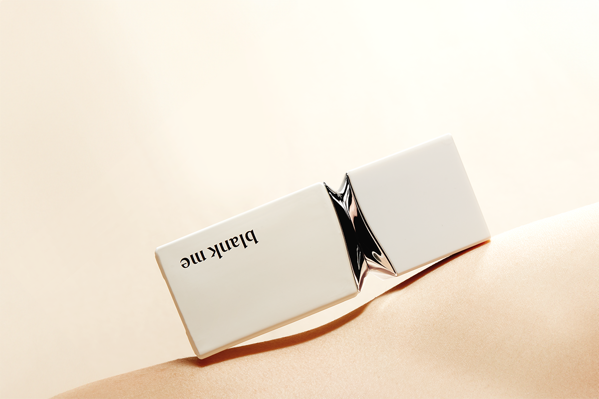
Material contrast sits at the centre of the design. A reflective metal surface moves across the body, set against a matte exterior. One engages with light and surrounding context, the other softens the presence of the object. Together, they express a transition between clarity and fluidity, reflecting the brand’s concept of “Blank Me to flow”.
The design is guided by reduction. Each element is considered only where necessary, allowing the form to remain clear and resolved. The curved division becomes the defining gesture, not as decoration, but as a way to organise surface, material, and visual identity into a single, coherent expression.
Rather than relying on excess detail, the design is defined by its proportion and material composition. An object that holds its presence through restraint, where contrast and continuity work together to shape a distinct and recognisable identity.